Wednesday, September 26, 2012
Matt's: The Best Mexican Food in the World
I created these signs using Adobe Illustrator and this reference: (http://megseeger1.files.wordpress.com/2010/11/elrancho.jpg). I tried to recreate the signs as well as I could, but could not find the exact fonts used. After finishing, I put two darker rectangles to the bottom and side of each sign to give the illusion that the sign is multidimensional. I also added a cloudy sky background for extra color on both works.
Tuesday, September 25, 2012
Fabulous Las Vegas
This is the sign I created using Adobe Illustrator and this source (http://layersmagazine.com/re-create-a-logo-in-illustrator-based-on-a-photo.html). The easiest part of creating this was finding the type and the hardest part was following and reading through all of the instructions.
Friday, September 21, 2012
Pen Practice
This was the practice with the Pen tool. I found this tool difficult to use at first, but got used to it as time went on.
Thursday, September 20, 2012
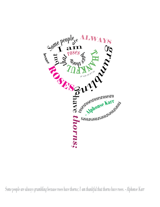
I am Thankful Roses Have Thorns
These are my interpretations of the quote "Some people are always grumbling because roses have thorns; I am thankful that thorns have roses." originally spoken by French writer, Alphonse Karr. I chose the quote both because it supports keeping a positive frame of mind- which I believe is important- and because of the quote's wittiness. In the first illustration shown above, I arranged the words to represent a rose. In the quote above however, I focused more on the flow and wording of the quote, than meaning behind it. For color, I chose are various shades of pink and green which I chose both because the colors are commonly associated with roses, and because they represent bliss, life, and peace.
Monday, September 17, 2012
Glyph Monster- Skeleton Jack
This is the Glyph Monster I made using Adobe Illustrator. The font I used was Modern No. 20 and the character I made was Jack from Tim Burton's The Nightmare Before Christmas. My biggest critique of this piece is that he does not appear as thin or willow-y as the character. My biggest struggle in the creation of this piece is that there were almost no glyphs provided that were completely filled in, thus it was difficult to create an illusion of shading.
Thursday, September 13, 2012
Movie Title With Color
Movie Quote
Friday, September 7, 2012
Wednesday, September 5, 2012
Elements of Design | Illastrator
This is an image I created using Adobe Illustrator. It demonstrates all the Elelments of Design
.
Form- The girl's profile in addition to the array of shapes featured in this work, shows form.
Space- Negative space is an important part of any piece, as it is this one. The pale pink background offers both a solid base and some breathing space for the designs in the foreground.
Texture- I used a grittier paint brush in the swirly bits to give the work more texture.
Shape- This piece has four main shapes: the pink rhombus, the gray-lavender rectangle, the small purple rectangle, and the girl's profile.
Color- The colors in this illustration emit a relaxed and happy feeling that comes from the light pinks and purples. The black swirly lines are outside of the color scheme to attract attention to them.
Tone- The tone of the colors is very light and seeks to make a viewer experience a muted kind of joy.
Size- The size of the face in comparison to the miscellaneous shapes that surround it serve to attract attention to it.
Monday, September 3, 2012
Elements of Design | Size
Size refers to variations in the proportions of objects, lines or shapes. There is a variation of sizes in objects either real or imagined. (some sources list Proportion/Scale as a Principle of Design)
These elements are used to create the Principles of Design. Principles are the results of using the Elements. When you are working in a particular format (size and shape of the work surface) the principles are used to create interest, harmony and unity to the elements that you are using. You can use the Principles of design to check your composition to see if it has good structure.
[http://www.cherrybam.com/spring-photography-graphics.php]
Elements of Design | Tone
Value, or tone, refers to the use of light and dark, shade and highlight, in an artwork. Some people also refer the lightness and darkness in an artwork as tints(light) and shades(dark). Black-and-white photography depends entirely on value to define its subjects. Value is directly related to contrast. Value is the relative degree of lightness in the graphic work of art or painting.
[http://www.instantshift.com/2009/12/19/100-beautiful-examples-of-black-and-white-photography/]
[http://www.instantshift.com/2009/12/19/100-beautiful-examples-of-black-and-white-photography/]
Elements of Design | Color
Color pertains to the use of hue in artwork and design. Defined as primary colors (red, yellow, blue) which cannot be mixed in pigment from other hues, secondary colors (green, orange, violet) which are directly mixed from combinations of primary colors. Further combinations of primary and secondary colors create tertiary (and more) hues. Tint and Shade are references to adding variations in Value; other tertiary colors are derived by mixing either a primary or secondary color with a neutral color. e.g. Red + White = Pink. Color is the quality of an object or substance with respect to the one reflected by it, and usually determined visually by measurement of hue, saturation and brightness of the reflected light.
[http://www.worqx.com/color/shade_tint.htm]
[http://www.worqx.com/color/shade_tint.htm]
Subscribe to:
Comments (Atom)


