Wednesday, September 26, 2012

Matt's: The Best Mexican Food in the World


I created these signs using Adobe Illustrator and this reference: (http://megseeger1.files.wordpress.com/2010/11/elrancho.jpg). I tried to recreate the signs as well as I could, but could not find the exact fonts used. After finishing, I put two darker rectangles to the bottom and side of each sign to give the illusion that the sign is multidimensional. I also added a cloudy sky background for extra color on both works.

Tuesday, September 25, 2012

Fabulous Las Vegas


This is the sign I created using Adobe Illustrator and this source (http://layersmagazine.com/re-create-a-logo-in-illustrator-based-on-a-photo.html). The easiest part of creating this was finding the type and the hardest  part was following and reading through all of the instructions.

Friday, September 21, 2012

Pen Practice

This was the practice with the Pen tool. I found this tool difficult to use at first, but got used to it as time went on.

Thursday, September 20, 2012

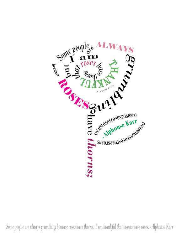
I am Thankful Roses Have Thorns


 These are my interpretations of the quote "Some people are always grumbling because roses have thorns; I am thankful that thorns have roses." originally spoken by French writer, Alphonse Karr. I chose the quote both because it supports keeping a positive frame of mind- which I believe is important- and because of the quote's wittiness. In the first illustration shown above, I arranged the words to represent a rose. In the quote  above however, I focused more on the flow and wording of the quote, than meaning behind it.  For color, I chose are various shades of pink and green which I chose both because the colors are commonly associated with roses, and because they represent bliss, life, and peace.

Monday, September 17, 2012

Glyph Monster- Skeleton Jack


This is the Glyph Monster I made using Adobe Illustrator. The font I used was Modern No. 20 and  the character I made was Jack from Tim Burton's The Nightmare Before Christmas. My biggest critique of this piece is that he does not appear as thin or willow-y as the character. My biggest struggle in the creation of this piece is that there were almost no glyphs provided that were completely filled in, thus it was difficult to create an illusion of shading.

Thursday, September 13, 2012

Movie Title With Color

This is the same quote I posted earlier,  with color. For this project, I chose a palette of  deep purples, teals, and mint greens and arranged them to fall in a rainbow-like pattern. I chose these colors to give a sense of elegance and regalement to the words like "film" and "fiction". I used the light blues to bring a sense of youth and joy to the words "moods" and feelings". Toward the end of the quote, I started using more mints and light greens to brin a sense of lightness and also to give the viewer the feeling that the quote is getting lighter as it ends.

Movie Quote

I created this in Adobe Illustrator. I used some of the Elements of Design, like shape, form, and line, to emphasize some of the words and draw the viewer's attention away from others. The quote is supposed to form a thought or speech bubble, I but I focused mostly  adjusting the words to flow down the page in a way that created movement. I also used the negative space to emphasize the quote as a whole.